
Methods Used on the Website of the National Healthcare Quality and Disparities Reports
Contents
- Overview
- What’s New
- Organization of the NHQDR Measures Within the Data Tools Website
- Available Comparisons
- National View
- State
- Data Query
- Special Emphasis
- Reports and Resources
- Citation
Overview
return to contents next section
The NHQDR pages (https://datatools.ahrq.gov/nhqdr) under the AHRQ Data Tools (previously the integrated National Healthcare Quality and Disparities Reports (NHQDRnet)) website provides comprehensive information about healthcare developments and overviews for policymakers, legislators, and reporters. It also contains detailed data for researchers. Comparative information, such as trends over time and current distance from achievable benchmarks, is easily accessible. The user can also “drill down” to more detailed information to demonstrate connections between the broader and more elemental levels.
The design of this website was based on recommendations from the National Academy of Medicine (NAM) (formerly Institute of Medicine [IOM]) on how to improve upon the NHQDR reports and related products. The aim was to facilitate greater impact regarding quality improvement and disparities elimination. A few key goals served as the foundation of the integrated NHQDR website design:
1. Bring together the NHQDR and related products in a way that produces a cohesive story about healthcare quality.
2. Present information in forward-looking and action-oriented formats.
3. Highlight equity as an integral part of overall quality, rather than as a separate storyline.
4. Present data as a solution to healthcare disparities, with prospects for evidence-based practices.
5. Improve overall navigation and usability of the site for various audiences.
The NHQDR website integrated information that was previously accessible from three different websites: National Healthcare Quality Report, National Healthcare Disparities Report, and State Snapshots. The NHQDR Data Tools site now houses the information previously available at the NHQDR website.
The following features were added to address the NAM recommendations:
1. Benchmarks based on performance of the top 10 percent of states, to encourage achievable goals
2. Displays that provide consistent definitions and comparisons across national and state levels
3. Displays of racial and ethnic comparisons, as a part of the larger quality evaluation
4. Provision of subject areas and topics that simplify access to the data and information
This Methods Report includes the following sections:
1. An overview of the organization and presentation of materials
2. An introduction to each of the five sections of the integrated NHQDR website—National, State, Data Query, Special Emphases, and Reports,
3. A description of the methods behind the various graphics and data presentations within the five sections
return to the top of this section
What’s New
return to contents next section
This section covers major changes on the website, data, and analysis methods, with the newest changes first.
2023 Report
Data Changes: The goal of the 2023 NHQDR is to examine the effect of COVID-19 on healthcare quality and disparities. To achieve this goal, data were collected for more than 120 COVID-19 measures from various sources. The measure values across characteristics are provided in Appendix B and the Data Query page.
Data Tools Changes: The special emphasis section will be updated in late 2023 to present information on four 2023 NHQDR special emphasis topics: impact of COVID-19 on population health, impact of COVID-19 on hospital care, impact of COVID-19 on ambulatory care, impact of COVID-19 on nursing homes, and growth of telehealth during the COVID-19 pandemic.
One single state dashboard now combines what used to be separate dashboards for State Snapshot Dashboard, Strongest and Weakest Measures by State, State Benchmark Dashboard: All Topics & Measures, State Benchmark Dashboard: Race & Ethnicity, and State Benchmark Dashboard: Income Levels.
Similarly, a new national dashboard now combines what used to be separate dashboards for National Trends Dashboard, National Benchmark Dashboard: All Topics & Measures, National Benchmark Dashboard: Race & Ethnicity, and National Benchmark Dashboard: Income Levels.
2022 Report
Data Tools Changes: The NHQDRNET website was transferred to the AHRQ Data Tools website located at https://datatools.ahrq.gov/nhqdr.
A special emphases dashboard will be added in early 2023 to for sections added to the 2022 report, including maternal health, oral health, and child and adolescent mental health. The original opioids special emphasis dashboard was expanded to include additional substance use disorder measures.
Data Limitations and Changes: Education and additional ethnic subgroups were included in the national and state data analysis. Household income and community income categories are now labeled as percentages of the federal poverty guideline (also called the poverty level (PL) rather than labels such as poor, low income, middle income, and high income.
More details about the measures are available in the data “Analysis Limitations” section in the Appendix A. Methods document.
Organization of the NHDQR Measures Within the Data Tools Website
return to contents next section
The NHQDR reports include approximately 240 core measures and over 470 supplemental measures that are collected from more than three dozen organizations, including AHRQ, the Centers for Disease Control and Prevention (CDC), the National Center for Health Statistics (NCHS), and the Centers for Medicare & Medicaid Services (CMS). The term measure is used to define a specific metric, such as “Adults who received a blood cholesterol measurement in the last 5 years” or “Deaths per 1,000 adult hospital admissions with congestive heart failure.”
Core measures are approved by the Interagency Work Group (IWG) for inclusion and are nationally representative. AHRQ receives these data regularly. Supplemental measures are typically new measures, have limited data availability, or lack clear direction of preferred outcome. These measures have not been approved by the IWG for inclusion in the core measure set.
The “National” and “State” panels on the Data Tools include all core measures with valid data and a small number of new and important measures that have not been approved by the IWG for inclusion in the core measure set.
Data for the supplemental measures can be found on the Data Query page only, excluded from all types of analysis. In the text below, the word “measures” indicates measures included in the national and state data analyses only.
To facilitate the evaluation of comprehensive overviews and trends, the measures are categorized into 15 subject areas.
- All Measures
- Priority Areas
- Access to Care
- Diseases & Conditions
- Race
- Ethnicity
- Income
- Health Insurance
- Metropolitan Status
- Age
- Gender
- Disability Status
- Education
- Setting of Care
- Type of Care
Not all subject areas have both national and state data.
Each subject area is further divided into topics, which are listed below.
NHQDR Data Tools Website Subject Areas and Topics, 2023
1.All Measures
2. Priority Areas
a. Care Affordability
b. Effective Treatment
c. Patient Safety
d. Person-Centered Care
e. Care Coordination
f. Healthy Living
3. Access to Care
a. Structural Access
b. Utilization
4. Diseases & Conditions
a. Cancer
b. Cardiovascular Disease
c. Chronic Kidney Disease
d. Diabetes
e. HIV and AIDS
f. Mental Health and Substance Use Disorder
g. Respiratory Diseases
5. Race
a. American Indian/Alaska Native (AI/AN)
b. Asian
c. Black
d. Multiple Races
e. Native Hawaiian/Pacific Islander (NHPI)
f. White
6. Ethnicity
a. Hispanic, All Races
b. Non-Hispanic, American Indian/Alaska Native (AI/AN)
c. Non-Hispanic, Asian
d. Non-Hispanic, Black
e. Non-Hispanic, Multiple Races
f. Non-Hispanic, Native Hawaiian/Pacific Islander (NHPI)
g. Non-Hispanic, White
7. Income
a. Less Than 100% of Poverty Level
b. 100%-199% of Poverty Level
c. 200%-399% of Poverty Level
d. 400% of Poverty Level or More
8. Health Insurance
a. Private Insurance
b. Public
c. Uninsured
9. Metropolitan Status
a. Large Central Metro
b. Large Fringe Metro
c. Medium Metro
d. Small Metro
e. Micropolitan
f. Noncore
10. Age
a. Children
b. Young Adults
c. Middle Aged Adults
d. Elderly Adults
11. Gender
a. Female
b. Male
12. Disability status
a. With Disability
b. Without Disability
13. Education
a. Less Than High School Graduate
b. High School Graduate
c. At Least Some College
14. Setting of Care
a. Ambulatory
b. Home Health-Hospice
c. Hospital
d. Nursing Home
15. Type of Care
a. Ambulatory
b. Acute Care
c. Chronic Pain
d. Prevention
Measures are often included in more than one subject area and topic. For example, the measure “Adults who received a blood cholesterol measurement in the last 5 years” is included under Cardiovascular Disease within Diseases and Conditions, under Prevention within Type of Care, and under Ambulatory within Setting of Care. The measures that are reported under Priority Populations, Income, Residence Location, and Health Insurance are limited to those that have sufficient data to include them as a reporting category.
return to the top of this section
Available Comparisons
return to contents next section
Within the different subject areas and topics, the integrated NHQDR website presents three types of comparative information:
1. National and state-level comparisons with achievable benchmarks
2. National trends over time
3. State-level comparisons with the national overall estimates (i.e., State Snapshots)
National trends are always highlighted in the NHQDR reports. State-level comparisons with national overall estimates had been highlighted in the State Snapshot. The addition of the comparison with achievable benchmarks was based on the IOM recommendations to promote best-in-class achievement at both the national and state levels.
return to the top of this section
National and State-Level Comparisons With Achievable Benchmarks
return to contents next section
Comparisons with achievable benchmarks are made against standards based on the performance of the top 10% of states. These standards are considered achievable because they have already been attained by the best performing states.
State-level benchmarks are only determined for NHQDR measures that have state-level data for at least 30 states. The benchmark for a measure is calculated as an average of the top 10% of reporting states. For example, if data from 50 states are available for a measure, then the benchmark is the average of the measure estimate across the top 10 percent (i.e., 5 states, unless there are ties). Since the 2017 report, 2015 data were selected first for the benchmark calculations, if available; otherwise, 2016 or 2014 data were selected.
Measure estimates for the national overall, national topics, state overall, and State topics are compared with the state-derived benchmark for that measure. Based on this comparison, national and state-level measure estimates are assigned to one of three categories: achieved the benchmark or better, close to the benchmark, or far from the benchmark. These categories are defined below.
1. Achieved the benchmark or better. The value for a measure is at least 90% of the benchmark value. This includes the case in which the measure’s value is equal to or better than the benchmark.
2. Close to the benchmark. The value for a measure is between 50% and 90% of the benchmark (i.e., the value for a measure is at least 50% of the benchmark value but has not reached the 90% criterion for having achieved the benchmark).
3. Far from the benchmark. The value for a measure has not achieved 50 percent of the benchmark.
When comparing estimates with the benchmarks, one critical consideration is the direction of the outcome. Specifically, a low value is the desired outcome for some measures, such as mortality, unmet needs, and communication problems. In contrast, a high value is the desired outcome for other measures, such as receiving recommended tests or reporting good communication. Consider a measure in which a low number is desired, such as “Adults who needed to see a specialist in the last 12 months who found it difficult to see a specialist.” If the benchmark is 18.1 and the national estimate is 14.6, then the measure achieved the benchmark—its value is 19% lower than the benchmark (the preferred direction). If the national estimate is 22.0, then it would be considered close to the benchmark—its value is 20% higher than the benchmark. If the national estimate is greater than 27.2, the measure would be considered far from the benchmark—its value is more than 50% larger.
return to the top of this section
National Trends Over Time
return to contents next section
National trends are determined for NHQDR measures with at least 4 years of data. The time span can vary across measures depending on how frequently data for the measures are collected. For example, measures based on data collected annually can be reported as trends after 4 years, while measures based on data collected every other year can be reported as trends after 8 years. Beginning with the 2016 report, the average annual percent change (AAPC) has been estimated using unweighted log-linear regression.
Model: ln(M) = β0 + β1Y,
where ln(M) is the natural logarithm of the aligned rate, β0 is the intercept or constant, and β1 is the coefficient corresponding to year Y
- Interpretation:
- Improving = Average annual percentage change >1% per year in a favorable direction and p<0.10.
- Worsening = Average annual percentage change >1% per year in an unfavorable direction and p<0.10.
- No Change = Average annual percentage change ≤1% per year or p≥0.10.
A probability of 0.10 was selected as the significance level because the magnitude of the standard errors varied considerably by type of data.
return to the top of this section
State Snapshot Comparisons
return to contents next section
Each State’s performance is compared with the national overall estimate. Data for each subject area and topic is also compared with the national overall estimate, not the national estimate for the topic. This approach is in contrast to the comparison with an achievable benchmark in which the comparison is with the average of the top 10% of states.
The national overall estimate is the estimate from micro data. If it is not available, the all-state average is calculated as the national overall estimate.
For each measure, state performance is categorized as better-than-average, average, or worse-than-average relative to the national overall estimate.
These comparison categories are defined based on a statistical test for differences:
1. Better-than-average. The state rate on an NHQDR measure is better than the national overall estimate, and that difference is statistically significant.
2. Average. The state rate on an NHQDR measure is not statistically different from the national overall estimate.
3. Worse-than-average. The state rate on an NHQDR measure is worse than the national overall estimate, and that difference is statistically significant.
Beginning with the 2016 report, two criteria have been used to define the difference between the state rate and the national overall estimate:
1. The absolute difference must be statistically significant with p <0.05 on a two-tailed test.
2. The relative difference must be at least 10% when framed negatively.
Across a group of measures within a subject area and topic, each state receives a performance meter score. First, points are assigned to each measure as follows:
1. 1 point for each state-level measure that was better than the national overall estimate
2. 0.5 points for each state-level measure that was average, relative to the national overall estimate
3. 0 points for each state-level measure that was worse than the national overall estimate
Next, the points are combined into a meter score:
((A*1) + (B*0.5) + (C*0)) * 100 A + B + C
Where
A = number of better-than-average NHQDR measures in the summary
B = number of average NHQDR measures in the summary
C = number of worse-than-average NHQDR measures in the summary
Example: North Dakota has 37 better-than-average measures, 61 average measures, and 11 worse-than-average measures. Thus, A = 37, B = 61, and C = 11.
(37 * 1) + (61 * 0.5) + (11 * 0)) * 100/(37 + 61 + 11)) = (37 + 30.5 + 0) * 100/109 = 67.5 * 100/109 = 6,750/109 = 61.93
Meter scores range from 0 (all measures are worse than average) to 100 (all measures are better than average). Scores between 0 and 100 represent the mix of measures that are worse than average, average, and better than average. Higher scores represent better performance, because the score increases with the number of measures that are average and increases more rapidly with the number of measures that are better than average.
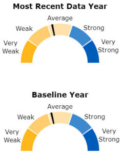
A 180-degree colored semicircle divided into five categories is used for visual presentation of the data. The five categories are:
1. Very Weak: 0 ≤ score < 20
2. Weak: 20 ≤ score < 40
3. Average: 40 ≤ score < 60
4. Strong: 60 ≤ score < 80
5. Very Strong: 80 ≤ score ≤ 100
The meter score for a given measure is depicted on the semicircle as a performance meter arrow as shown in Figure 1. A solid arrow is used for the most recent year of available data, if at least five measures are available. A dashed arrow is used to show performance for the baseline year when the baseline has more than two-thirds of the measures available in the most recent year. This criterion is applied to ensure similar comparisons between the baseline and the most recent year. For the 2016 report, measures with the latest year before 2013 were excluded from the most recent year’s comparison.
The state overall meter scores are more reliable and stable than the state topic scores mainly because the number of measures with valid data for each topic within a state is usually much smaller than that for the state overall. The number of data years and measure types with valid data may also affect the meter scores. Please keep these factors in mind when interpreting the meter scores and check the underlying data for details.
Figure 1: Performance Meter
return to the top of this section
National
return to contents next section
The National section provides an overview of performance across NHQDR measures. This perspective shows areas of strengths and weaknesses at a glance. This section provides two types of comparative information:
1. Current data compared with “achievable benchmarks”
2. Trends over time
This information is available across all NHQDR measures and by subject area and topic if data are available.
Comparisons With Achievable Benchmarks
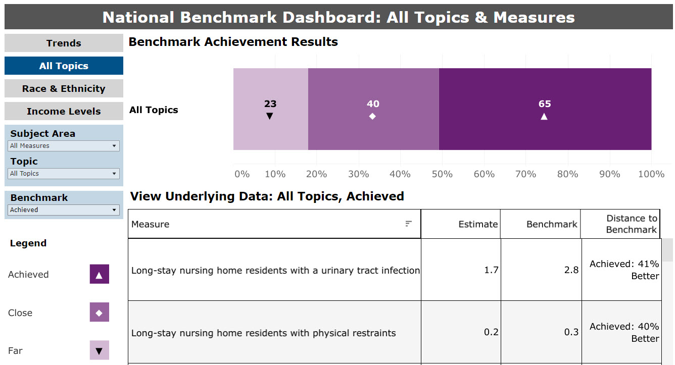
On the National page, there are comparisons with achievable benchmarks across all measures, which are organized in several categories, by measure areas, and by topics. The methods for the benchmark comparison are detailed under the section of this report titled National and State-Level Comparisons With Achievable Benchmarks.
The first summary graphic displays the total frequencies of each category of achievement (Figure 2). If a measure does not have an available benchmark (i.e., no state data from which to calculate a benchmark), it is not represented in the summary graphic. In the example in Figure 2, benchmarks are available for 128 measures: 23 measures that are far from the benchmark, 40 measures that are close to the benchmark, and 65 measures that have achieved or performed better than the benchmark.
Figure 2: National View Benchmark Summary, All Measures
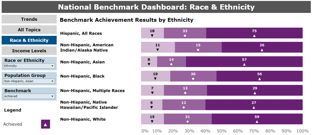
The second summary graphic displays the total frequencies of each category of achievement by race or race and ethnicity. The latter is shown in Figure 3. For measures that report data, the race and ethnicity comparison with benchmarks is provided for individuals who are Hispanic, All Races; Non-Hispanic, American Indian/Alaska Native; Non-Hispanic, Asian; Non-Hispanic, Black; Non-Hispanic, Multiple Races; Non-Hispanic, Native Hawaiian/Pacific Islander; and Non-Hispanic, White.
Figure 3: National Benchmark Summary, by Race and Ethnicity
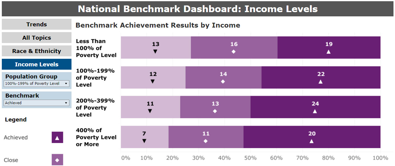
The third (final) summary graphic displays the total frequencies of each category of achievement by income (Figure 4). For measures that report data, the comparison with benchmarks is provided for people living in households or communities at percentages of the PL.
Figure 4: National Benchmark Summary, by Income
return to the top of this section
Trends Over Time
return to contents next section
Within National data, the user may also view summary results of trending over time across all measures and by subject areas and topics. The methods for the trend comparison are detailed under the section of this report titled National. Since the 2016 report, the trending method for the Data Tools is the same as the trending method for the NHQDR.
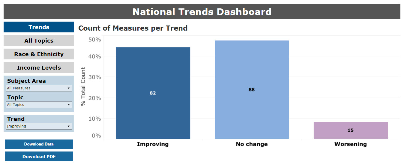
The trends summary graphic displays the total frequencies of each category of achievement. Select a Subject Area and Topic to get the trend summary graphic for each topic. In Figure 5, there are 82 measures showing improvement over time, 88 measures with no change, and 15 measures worsening over time. Measures with neither trend results nor benchmark results are excluded from the National and State pages.
Figure 5: National Summary of Trends in Measures Over Time
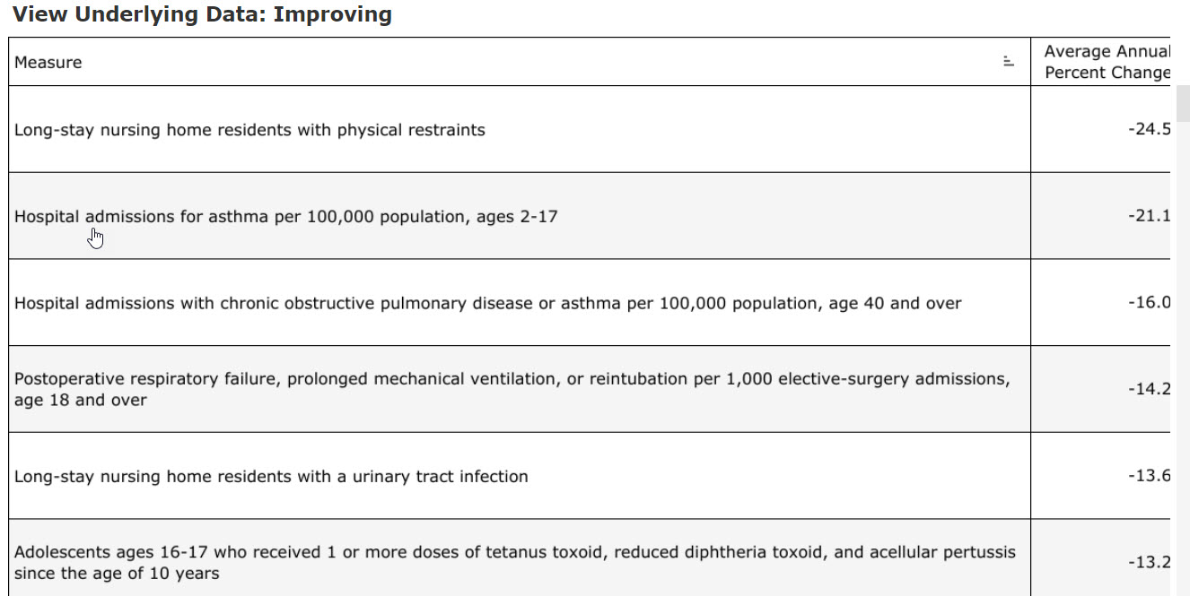
The user can obtain information about (1) which measures are included in the different achievement categories and (2) the annual average percent change, by using the Trend filter or viewing the “View Underlying Data” table. An example is provided in Figure 6.
Figure 6: Data Table Underlying the Trend Bar Charts
return to the top of this section
State
return to contents next section
The State page on the Data Tools is similar to the National page in that it provides an overview of performance across NHQDR measures and by measure areas and topics. In addition, it provides an overview of a State’s overall performance and a state’s performance for each topic. This approach allows the user to review each state’s areas of strengths and weaknesses. This section provides two types of comparative information:
1. Current data compared with “achievable benchmarks”
2. State Snapshot comparisons with national estimates
This information is available across all state-level measures and by subject area and topic.
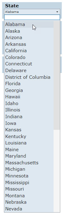
Users begin by selecting a state from the state filter drop-down box (Figure7).
Figure 7: State Selection
return to the top of this section
State Snapshot
return to contents next section
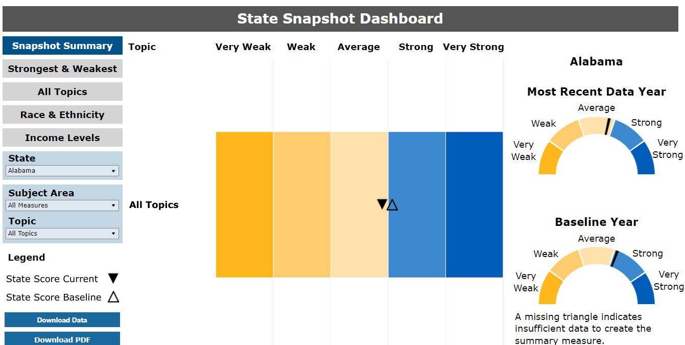
The State Snapshot Dashboard provides insight into a selected state’s performance overall or by topic within a state by comparing it with the national average for the available measures. The methods for the State Snapshot are detailed under the section of this report titled State Snapshot Comparisons.
Figure 8 shows the State Snapshot performance meter for a sample state. Across all measures assessed, the state performed worse in the most recent data year than in the past (baseline year). In addition, the state’s performance is in the “average” range relative to the comparisons with the all-state averages.
Figure 8: State Snapshot Performance Meter
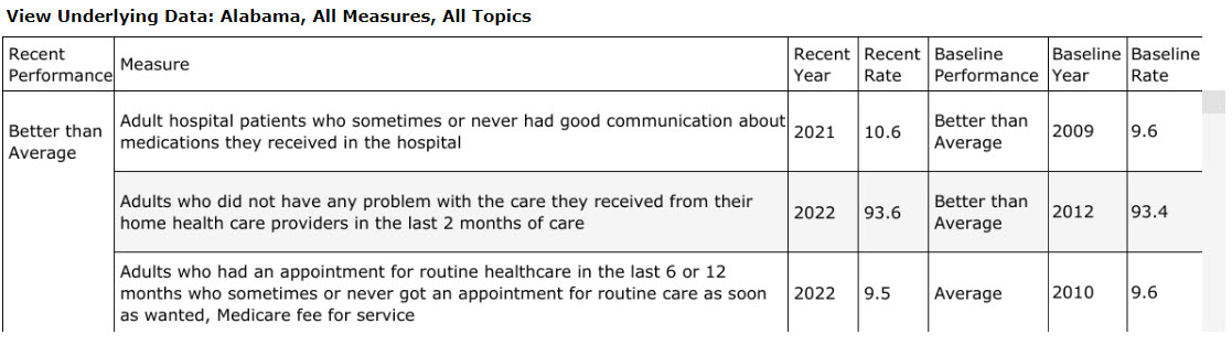
Beneath the performance meters is a table that lists the meter score. The data table can be filtered by state. The user can obtain information about (1) which measures are included in the performance meter score and (2) the average annual percent change, by sorting the Recent Performance column in the “View Underlying Data” table. An example is provided in Figure 9. The state performed better in the most recent data year than it had performed in the past (baseline year) for the “Adult hospital patients who sometimes or never had good communication about medications they received in the hospital” measure. The most recent score was 10.6, which is better than its baseline score of 9.6.
Figure 9: Data Table Underlying the State Snapshot Performance Meter
return to the top of this section
State Dashboard
return to contents next section
The State Snapshot Dashboard can also provide “snapshot” information across specific subject areas and topics. Based on the subject area and topic selections, rectangular versions of the performance meter present information on each subject area and topic. The methods for the State Snapshot meters are detailed under the section above called State Snapshot Comparisons.
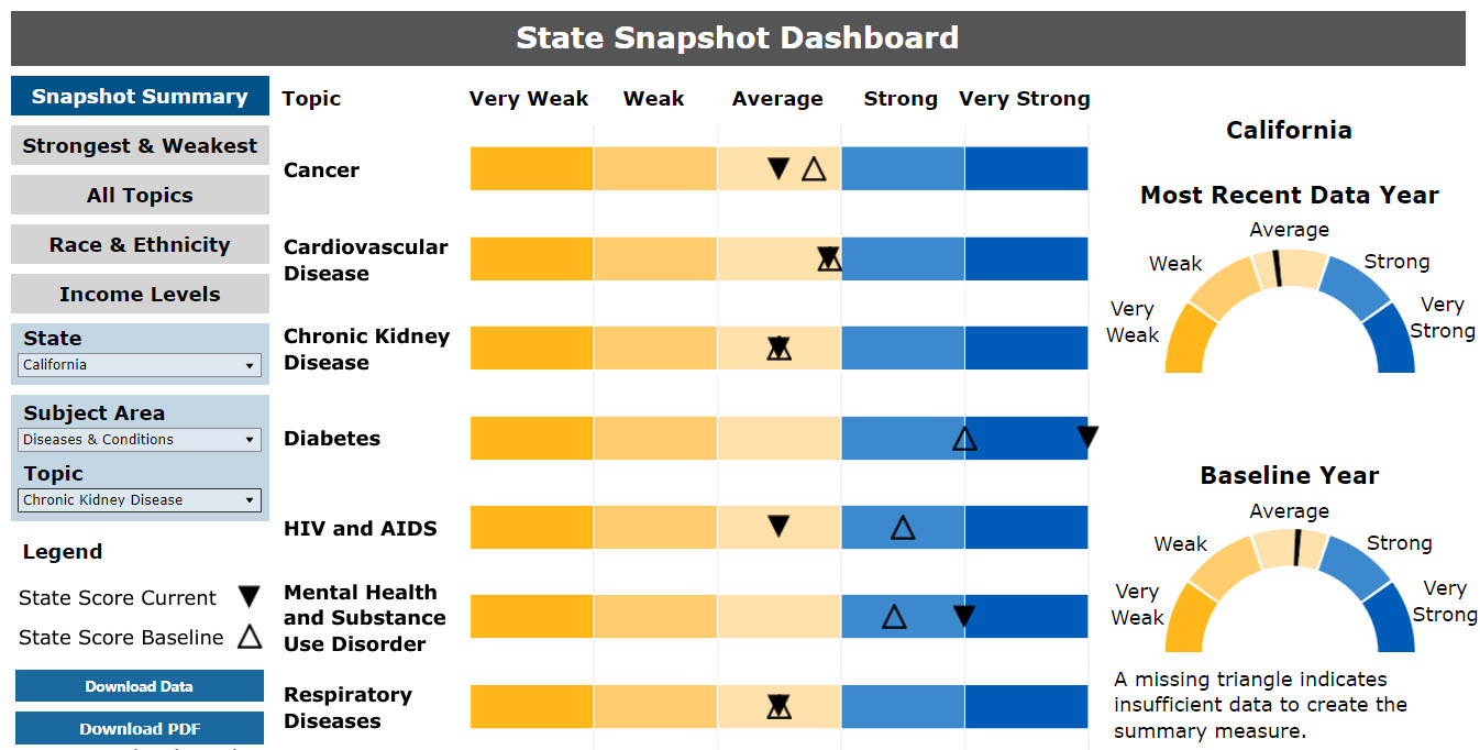
Figure 10 shows a portion of a sample State Snapshot Dashboard for a specific subject area and topic. The inverted triangles (black) indicate performance in the most recent data year; the regular triangles (translucent) indicate performance in the baseline year.
For the Diseases & Conditions subject area, the state’s performance improved in the areas of diabetes and mental health and substance use disorders. For diabetes, the state’s performance improved from the strong range in baseline to the very strong range in the most recent year. Performance declined for cancer and HIV/AIDS. Quality performance in the areas of cardiovascular disease, chronic kidney disease, and respiratory diseases did not change from the baseline year to the most recent year, as indicated by two triangles in the same location. If a topic is not displayed, it means the state has no data on these measures.
Figure 10: Example of State’s Dashboard Meters
return to the top of this section
State Comparisons With Achievable Benchmarks
Similar to the National page, the All Topics comparative graphic under the State page is a summary of quality measures compared with achievable benchmarks. Summaries are available across all state-specific measures, by subject areas and topics, by race and ethnicity, and by income. Select a subject area, then a topic for summary results for a particular topic.
The methods for the benchmark comparison are detailed under the section of this report titled National and State-Level Comparisons With Achievable Benchmarks.
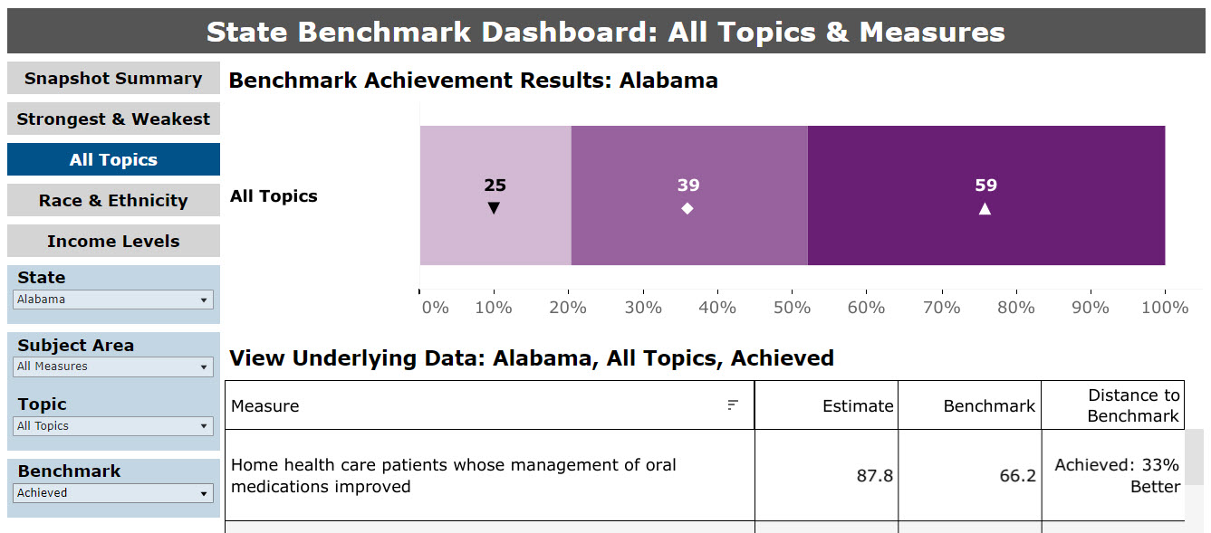
The All Topics summary graphic displays the total frequencies of each category of achievement, where state-specific data and benchmarks are available (Figure 11). If a measure does not have an available benchmark, it is not represented in the summary graphic. In the example in Figure 11, benchmarks are available for 123 measures reported for the state: 25 measures that are far from the benchmark, 39 measures that are close to the benchmark, and 59 measures that have achieved or performed better than the benchmark.
Figure 11: State Summary Graphic Compared with Benchmarks
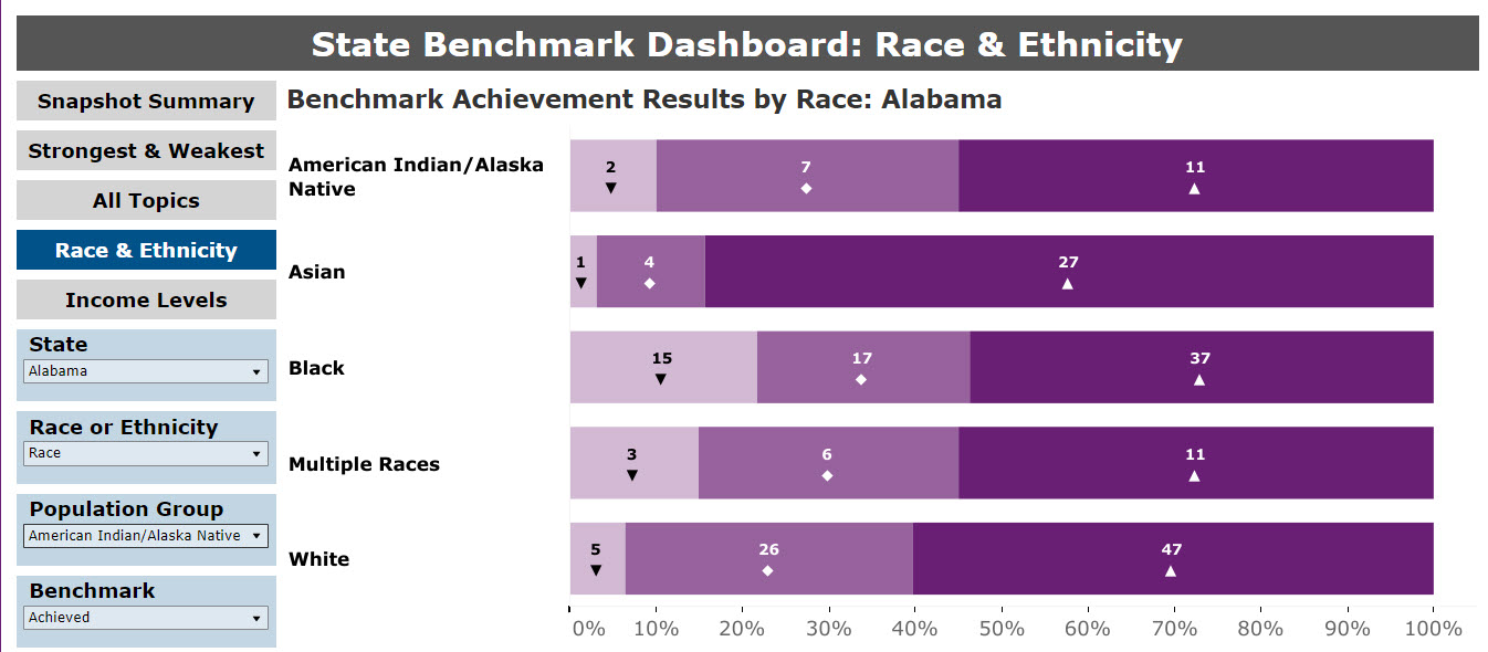
The Race & Ethnicity summary graphic displays the total frequencies of each category of achievement by race or race and ethnicity. The former is shown in Figure 12. For measures that report data for the selected state, the race comparison with benchmarks is provided for individuals who are American Indian/Alaska Native; Asian; Black; Multiple Races; Native Hawaiian/Pacific Islander; and White.
Figure 12: State Benchmark Summary, by Race and Ethnicity
The Income Levels summary graphic displays the total frequencies of each category of achievement by household income or community income (Figure 13). For measures that report data for the selected state, the comparison with benchmarks is provided for people living in households or communities at percentages of the PL.
Figure 13: State Benchmark Summary, by Income
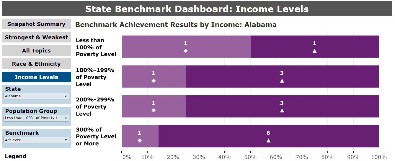
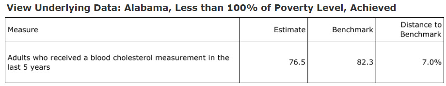
The user can obtain information about (1) which measures are included in the different achievement categories and (2) the value of the achievable benchmarks, by selecting the Population Group, and Achievement Benchmark viewing the “View Underlying Data.” table. An example is provided in Figure 14.
Figure 14: Data Table Underlying the Achievable Benchmark Bar Charts
return to the top of this section
Data Query
return to contents next section
The Data Query section of the NHQDR Data Tools site allows users to choose individual measures rather than summaries of performance. Figure 15 shows a view of the “Data Query Tool” filter selections available. The user has options to choose measures available for National Trends, National Categories, National Disparities, State Trends, and State Categories.
1. Geographic area – National or State is noted on the buttons for selection, including National Trends, National Categories, National Disparities, State Trends, and State Categories.
2. Priority Area – filter by Access, Affordable Care, Care Coordination, COVID-19 Experiences, Effectiveness of Care, Healthy Living, Patient Safety, Person-Centered Care, Priority Population, or Supplemental Measures.
3. Section – filter within a Priority Area.
4. Measure – filter by specific measures available. Type keyword text within the box directly to locate measures with specific text.
5. Category – Refine table and graph results using Categories available per measure for National Categories, National Disparities, and State Categories.
These selections define the list of available measures. Only one measure can be selected at a time. The user can choose to examine the measure over time (Trending) or by Categories as well as a Disparities focus. The available categories and filters depend on the available data reported to the NHQDR from the original data source.
Figure 15: Data Query Filters
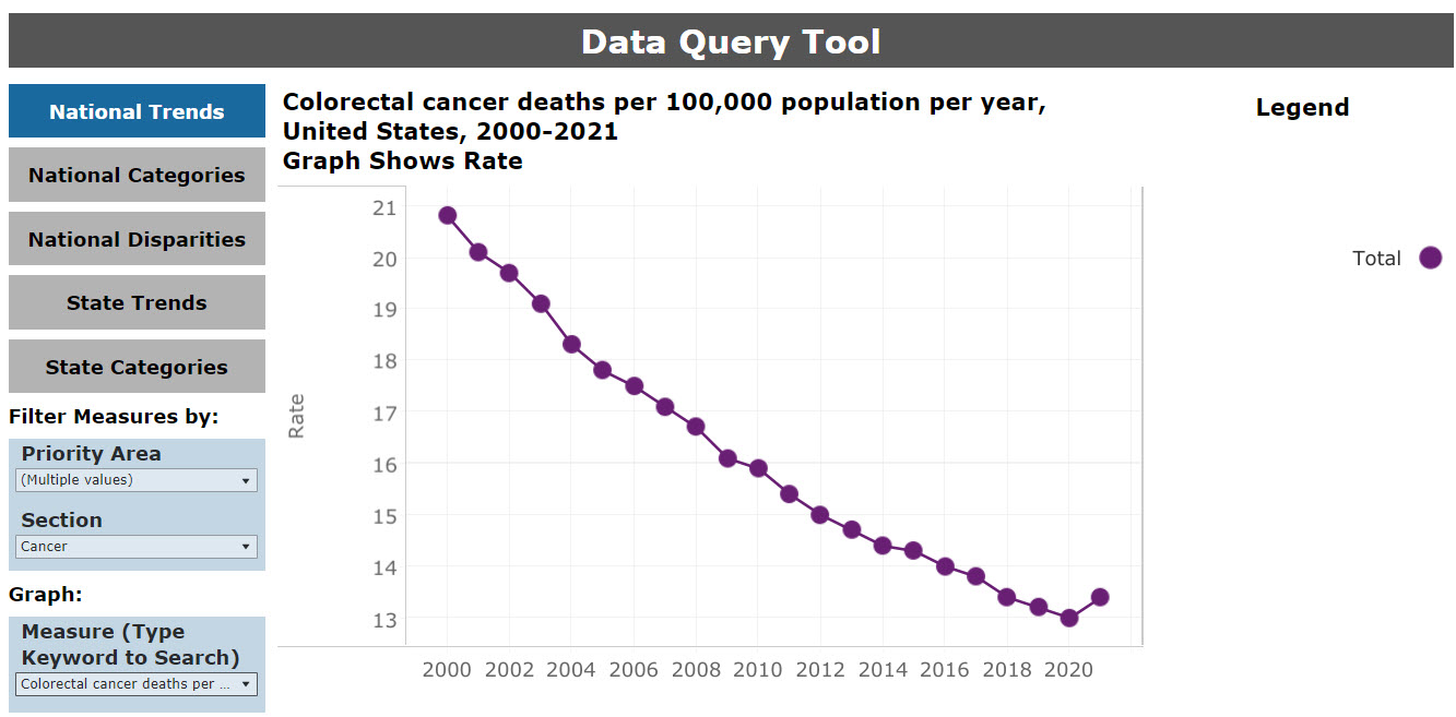
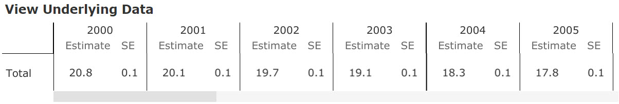
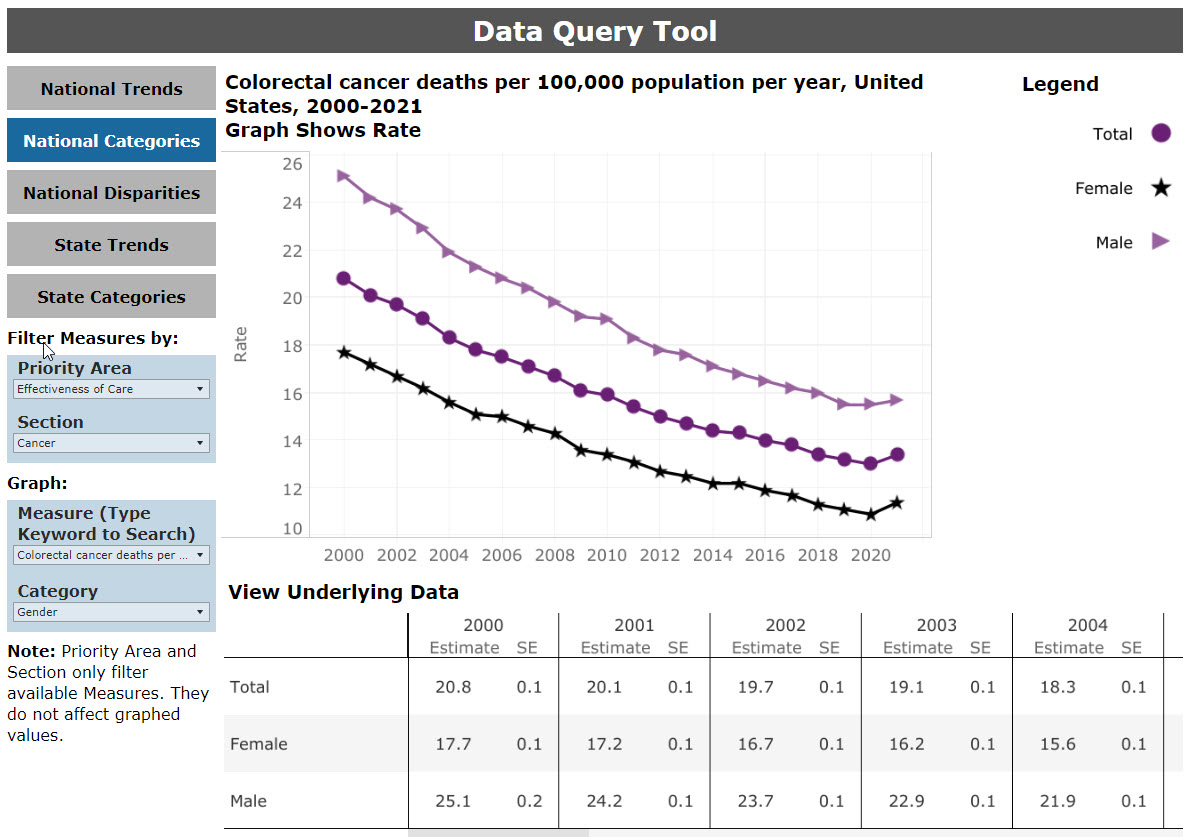
Based on the user’s selections, the data query dashboard will return an underlying data table of the information. The information is a subset of the rows in the full NHQDR data table for the chosen measure. The results of a query on the National measure “Colorectal cancer deaths per 100,000 population per year” are shown in Figure 16.
Links for the measure source and specification are available by selecting the “Download Data” button under the data table.
Figure 16: Data Query Table Results
Users can view a graphical depiction of the selected data query above the data table. When the query is specific to trends over time, a line graph is displayed (Figure 17). When one or two categories are selected, bar graphs are used to depict the data.
Figure 17: Data Query Graphic for Results by Category
return to the top of this section
Special Emphasis Dashboards
return to contents next section
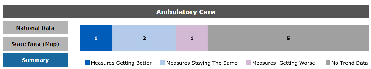
The special emphasis dashboards facilitate access to data, trend results, graphs, and state quartile maps of measures related to special emphasis topics. For the 2023 NHQDR, there are four special emphasis dashboards: ambulatory care, hospital care, nursing home, population health. The bar chart on the Summary option (Figure 18) is the national overall trend result, showing the number of measures that have been getting worse, staying the same, or getting better. The analysis method is the same as the national trend analysis described under the section titled National Trends Over Time.
Figure 18: Ambulatory Care National Trend Results
For detailed data by population characteristic, users can select an individual measure under the National Data option, as shown in in Figure 19. Supporting tables, measure specifications, and data source descriptions are also linked for each measure.
Figure 19: Ambulatory Care National Data
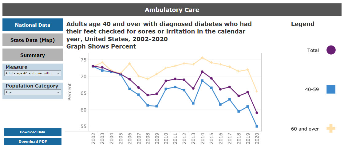
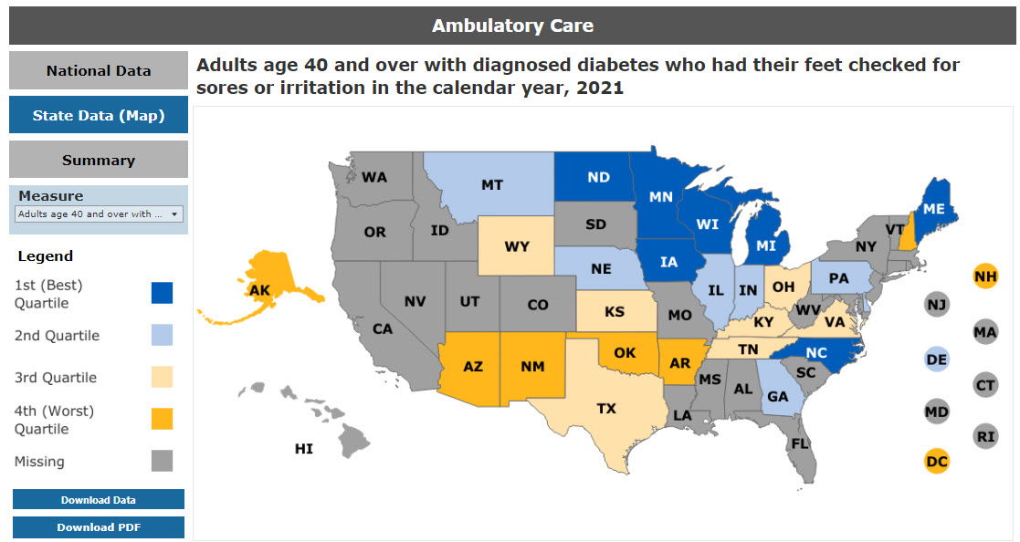
Figure 20 shows the image for the State Data (Map) section, a map of measure data by state quartile values for an example special emphasis topic.
Figure 20: Ambulatory Care State Map Results
return to the top of this section
Reports and Resources
return to contents next section
The Reports and Resources section of the NHQDR Data Tools website provides links to a glossary, a featured chartbook, reports, and resources.
The glossary provides a list of terms that appear in the reports.
The featured chartbook and other chartbooks found under the reports header provide focused data on an NHQDR priority area or priority population.
The reports section links to the files of the most recent NHQDR and to the web pages for previous NHQDRs and additional reports, including chartbooks, data spotlights & infographics, and related reports.
Data spotlights & infographics present data on specific areas of interest, such as infant mortality. They also include information on AHRQ research topics and programs, such as children’s health, computers and medical informatics, coronary artery disease, diabetes, healthcare costs, health literacy and cultural competency, hypertension, and patient-centered care.
The section on related reports links to reports from IOM, AHRQ, CDC, and the National Academy for State Health Policy that relate to access, disparities, and other issues germane to the NHQDR.
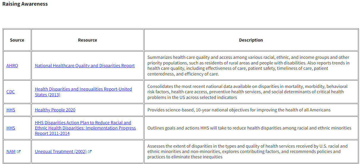
The resources section of the NHQDR Data Tools website page contains a catalog of publications and web tools. These resources provide information that is useful to quality improvement and disparities reduction activities. They are categorized into seven focal areas—
1. Raising awareness
2. Collecting data
3. Analyzing data
4. Reporting data
5. Identifying best practices
6. Tracking success
7. Focusing on specific vulnerable populations
The source, title, and a brief description are provided for each resource. Figure 20 shows an example of the resources for addressing disparities and improving quality under Focusing on Specific Vulnerable Populations.
Figure 20: Selection of Resources for Addressing Disparities and Improving Quality “Focused on Specific Vulnerable Populations”
return to the top of this section
Last Updated: November 2023
Citation
Methods Used on the Website of the National Healthcare Quality and Disparities Reports. November 2023. Rockville, MD: Agency for Healthcare Research and Quality.